LP5 - Inferno
Moderators: Aesthetics, Drones, Hexagon Sun
-
- Eagle Minded
- Status: Offline
- Posts: 355
- Joined: 24 Apr 2015
- Location: Somewhere on the American continent
IT'S HAPPENING!!! The Bleep website was being odd for me too, so I ordered through Bandcamp with no problem. And now we wait... 
Red -
Orange - Aquarius
Yellow - Alpha and Omega
Green -
Blue -
Purple - Music is Math

Orange - Aquarius
Yellow - Alpha and Omega
Green -
Blue -
Purple - Music is Math
-
- New Seed
- Status: Offline
- Posts: 2
- Joined: 22 Apr 2026
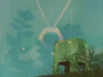
Hey, this is my first post here, I'm super excited for the new LP and found through this site that there will be planned listening events, a possible music video and more! https://thevaultcollectiveltd.co.uk/pro ... da-inferno
 (direct link to image)
I linked the poster directly but seems like the product page doesn't show the image anymore.
(direct link to image)I linked the poster directly but seems like the product page doesn't show the image anymore.
Last edited by KryoComb on Wed Apr 22, 2026 5:04 pm, edited 1 time in total.
- Posts Quantity
- Status: Offline
- Posts: 103
- Joined: 22 Apr 2013
- Location: Montreal, QC
Prophecy At 1420 MHz
They're referencing the "WOW! signal"
In a 1959 paper, Cornell University physicists Philip Morrison and Giuseppe Cocconi had speculated that any extraterrestrial civilization attempting to communicate via radio signals might do so using a frequency of 1420 megahertz (21-centimeter spectral line), which is naturally emitted by hydrogen, the most common element in the universe and therefore likely familiar to all technologically advanced civilizations.
https://en.wikipedia.org/wiki/Wow!_signal
Last edited by jf on Wed Apr 22, 2026 4:58 pm, edited 1 time in total.

-

- Sherbet Head
- Status: Offline
- Posts: 555
- Joined: 17 Aug 2005
- Location: Netherlands
Just had to log in for the first time since 13 years to say I’m equally as excited as everyone else on here (and fun to see some others dust off their accounts)!
Also the records are available to pre-order online at my local (Dutch) record store now (just ordered the red vinyl version!), so for those struggling with Bleep check your local options as well!
And, not sure if this was mentioned before, announcing this album on Earth Day can’t be a coincidence right?
-
- Posts Quantity
- Status: Offline
- Posts: 110
- Joined: 21 Apr 2022
- Location: UK
I wondered if track 06 “somewhere right now in the future” is a reference to Sean from Autechre’s amazing quote about BoC “they’re probably somewhere in the future, worrying about why it’s not like the past”
-
- Boqurant
- Status: Offline
- Posts: 95
- Joined: 15 Apr 2026
Skytree wrote:sowhereareyouliving? wrote:What do we think of the family logo thing on the main website? https://boardsofcanada.com/
IMO they look a bit weird, their heads are too big. And they're facing away. And there's 4 kids? Huge family by today's standards
To me it doesn't look like a family, but rather a timeline of two figures (male and female) growing up.
The outlines of the two central figures look like teenagers, not adults, but that's just a guess.
They just seem intentionally self-similar compared to their other "family" logos/icons, where the adults and children are clearly delineated.
That's an interesting point, I guess the middle pair could be teenagers, which makes it ... weirder
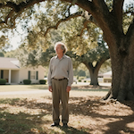
I remember when this was fields
-
- Dayvan Cowboy
- Status: Offline
- Posts: 1428
- Joined: 21 May 2013
Hahaha I'm in a virtual queue to order a t shirt. Liking the album cover, very 70s.

- Posts Quantity
- Status: Offline
- Posts: 103
- Joined: 22 Apr 2013
- Location: Montreal, QC
Wildfire wrote:dontcryforcryda wrote:Not feeling the album art. The font doesn't scream BOC and neither does the title.
It is literally the same font that's on Music Has The Right To Children cover - ITC Bauhaus, it's just larger and bold and upper case. I personally love it, total 70s video nasty vibe.
It's not the same font. Source: I'm a designer.
-
- Sherbet Head
- Status: Offline
- Posts: 926
- Joined: 23 Mar 2007
- Location: Philadelphia, PA
observation wrote:Thanks skytree! I couldn't figure out how to post the image. Duh.
My pleasure. The forum post functions are pretty ancient! I'm so old I used to design websites in Notepad. It's good to feel useful.
-
- Posts Quantity
- Status: Offline
- Posts: 174
- Joined: 10 May 2013
Arena Americanada (love)
Welcome to hell!

Welcome to hell!
-

- Sherbet Head
- Status: Offline
- Posts: 527
- Joined: 16 Mar 2011
- Location: Over The Horizon Radar, Canada
I GOT THROUGH VIA BLEEP - PRE-ORDER CONFIRMED
Good luck everyone!
Good luck everyone!
I AM GOD. THE ULTIMATE RESONANCE.
There are a lot of different 'me's, you know. There's the mad me, when I get angry.
There are a lot of different 'me's, you know. There's the mad me, when I get angry.

-
- Sherbet Head
- Status: Offline
- Posts: 926
- Joined: 23 Mar 2007
- Location: Philadelphia, PA
sowhereareyouliving? wrote:That's an interesting point, I guess the middle pair could be teenagers, which makes it ... weirder
Aye, seems to me like a purposeful twist on familiar BoC iconography. They're not holding hands either, like they're separated by time.
-
- Sherbet Head
- Status: Offline
- Posts: 683
- Joined: 2 May 2011
Skytree wrote:sowhereareyouliving? wrote:What do we think of the family logo thing on the main website? https://boardsofcanada.com/
IMO they look a bit weird, their heads are too big. And they're facing away. And there's 4 kids? Huge family by today's standards
To me it doesn't look like a family, but rather a timeline of two figures (male and female) growing up.
The outlines of the two central figures look like teenagers, not adults, but that's just a guess.
They just seem intentionally self-similar compared to their other "family" logos/icons, where the adults and children are clearly delineated.


My heart is full of light and love and sugar and caffeine
I live inside an antiquated obsolete machine ♪
-
- Eagle Minded
- Status: Offline
- Posts: 314
- Joined: 7 Sep 2011
Yay! I was finally able to get thru bleep and order. So nice not having to wait so long, May 29th!
-

- Nova Scotia Robot
- Status: Offline
- Posts: 5141
- Joined: 1 Dec 2005
This. THIS is what I want to wake up to every morning!
Preordered!
Cannot fucking wait!
Those song titles!
AAAAHHHH!!!1
Preordered!
Cannot fucking wait!
Those song titles!
AAAAHHHH!!!1
Who is online
Users browsing this forum: No registered users and 15 guests