bocpages logo/banner contest
Moderators: Aesthetics, Drones, Hexagon Sun
- Sherbet Head
- Status: Offline
- Posts: 742
- Joined: 21 Aug 2006
anyway i think this place needs a design change more than bocpages does
-

- Sherbet Head
- Status: Banned !
- Posts: 591
- Joined: 12 Jun 2009
novayshun wrote:this is the only one i'm digging:

copyright
-
- Dayvan Cowboy
- Status: Offline
- Posts: 1378
- Joined: 1 Jul 2008
- Location: Bolton, Greater Manchester
xagoln wrote:Neels wrote: What if you'd replace the round shape of the letters into a kind of hexagon shape? Just to give it more of an overall boccy look. I'm not sure this will work out, maybe you'd give it a try?
That's a great idea.
But oh man does my attempt look horrible
Aaand this is just too much
Thanks for the comments everyone.


lol i love these too! You got epic design skillz man.
- Posts Quantity
- Status: Offline
- Posts: 218
- Joined: 19 Jul 2009
- Location: Montreal, QC
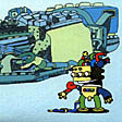
did this a few years ago...modded it for the banner


-

- Drone Operator
- Status: Offline
- Posts: 4655
- Joined: 28 Nov 2004
For now I'm most intrigued by xagoln's design. Even though I'm not 100% satisfied with that one yet. The positioning of the word pages could/should be different. It seems a bit out of place there. And it does not yet capture the boc vibe yet, there should be a little boccy addition or something...
bocpages could look like this at the moment:

Click for full size - Uploaded with plasq's Skitch
the actual pages are the very same (main colours: turquoise, green, white and grey) except for the logo.
bocpages could look like this at the moment:
Click for full size - Uploaded with plasq's Skitch
the actual pages are the very same (main colours: turquoise, green, white and grey) except for the logo.
- Sherbet Head
- Status: Offline
- Posts: 742
- Joined: 21 Aug 2006
Tekmosis wrote:novayshun wrote:this is the only one i'm digging:
copyright
same images can be found in the content of the wiki
-
- Sherbet Head
- Status: Offline
- Posts: 893
- Joined: 15 Nov 2007
- Location: Cape Town, South Africa
Fredd-E wrote:bocpages could look like this at the moment:
Click for full size - Uploaded with plasq's Skitch
I think this looks great.
I agree that 'pages' could be positioned differently. TOP NOTCH!
-

- Sherbet Head
- Status: Offline
- Posts: 871
- Joined: 15 May 2006
- Location: Chicago, IL
Fredd-E wrote:For now I'm most intrigued by xagoln's design. Even though I'm not 100% satisfied with that one yet. The positioning of the word pages could/should be different. It seems a bit out of place there. And it does not yet capture the boc vibe yet, there should be a little boccy addition or something...
bocpages could look like this at the moment:
Click for full size - Uploaded with plasq's Skitch
the actual pages are the very same (main colours: turquoise, green, white and grey) except for the logo.
Boards of Canda? Really?
-
- Sherbet Head
- Status: Offline
- Posts: 537
- Joined: 5 Feb 2008
- Location: Avignon
Yes this banner look really great.
- Posts Quantity
- Status: Offline
- Posts: 218
- Joined: 19 Jul 2009
- Location: Montreal, QC
s7409651 wrote:Fredd-E wrote:bocpages could look like this at the moment:
Click for full size - Uploaded with plasq's Skitch
I think this looks great.
I agree that 'pages' could be positioned differently. TOP NOTCH!
i agree with s7409651...i think it would simply take making the "PAGES" font less bold and a little smaller. it fills a bit too much of the C's opening.
perhaps something like...

-
- Drone Operator
- Status: Offline
- Posts: 4655
- Joined: 28 Nov 2004
the letter p wrote:i agree with s7409651...i think it would simply take making the "PAGES" font less bold and a little smaller. it fills a bit too much of the C's opening.
perhaps something like...
Great idea. A small change with quite a big positive impact. I like that.
Let's see what the creator could make out of it to further enhance it. It would be even greater if it could have just a little bit more the boc feeling. Don't know how but I guess there has to be something possible to give it that little bit extra.
And please, let's keep this thread on topic.

-
- Sherbet Head
- Status: Offline
- Posts: 871
- Joined: 15 May 2006
- Location: Chicago, IL
Fredd-E wrote:the letter p wrote:i agree with s7409651...i think it would simply take making the "PAGES" font less bold and a little smaller. it fills a bit too much of the C's opening.
perhaps something like...
Great idea. A small change with quite a big positive impact. I like that.
Let's see what the creator could make out of it to further enhance it. It would be even greater if it could have just a little bit more the boc feeling. Don't know how but I guess there has to be something possible to give it that little bit extra.
And please, let's keep this thread on topic.
Too much blank space at the top of the page. Needs to be a wider version of the logo (which would probably involve making 'pages' bigger, not smaller' or have to header redesigned for a narrower logo.
-
- Drone Operator
- Status: Offline
- Posts: 4655
- Joined: 28 Nov 2004
The header will in fact be smaller than the previous one. As a matter of fact like it is now it's already a bit reduced.Moebius wrote:Too much blank space at the top of the page. Needs to be a wider version of the logo (which would probably involve making 'pages' bigger, not smaller' or have to header redesigned for a narrower logo.
- Friendly Stranger
- Status: Offline
- Posts: 11
- Joined: 21 Oct 2009
- Location: Up north
Here's some variations of "pages".
I kinda like the bottom right one.

Everybody is of course free to modify these if they think of something.
The typeface I used is Avant Garde.
I kinda like the bottom right one.
Everybody is of course free to modify these if they think of something.
The typeface I used is Avant Garde.
-
- Eagle Minded
- Status: Offline
- Posts: 286
- Joined: 1 Jul 2009
- Location: Somewhere sometime
Don't know whether the crushing "pages" effect is essential. Tried to make "pages" more part of the logo with some minor modifications.... don't thinks these are the best ones, but might give ideas to others....

Unexpect the expected
-

- Sherbet Head
- Status: Offline
- Posts: 755
- Joined: 23 Sep 2009
- Location: East Coast
Hmm. I'm not digging the links.
Hows about typing BoC Pages on an old broken typewriter and scanning it into photoshop?
Hows about typing BoC Pages on an old broken typewriter and scanning it into photoshop?
Scott
-
- Sherbet Head
- Status: Offline
- Posts: 738
- Joined: 29 Sep 2005
the letter p wrote:did this a few years ago...modded it for the banner
this is a grower for me.. looks celestial.
don't know why the logo or design has to resemble a trademark.. not sure what criteria will judge the winner here..
- Posts Quantity
- Status: Offline
- Posts: 218
- Joined: 19 Jul 2009
- Location: Montreal, QC
just trying some simple things

Who is online
Users browsing this forum: aoc, Omikron, trois, Wildfire and 45 guests