bocpages logo/banner contest

Everything related to our favorite Scottish duo.

Moderators: Aesthetics, Drones, Hexagon Sun

Should the current bocpages logos be replaced?

Yes, it's long overdue!
24
48%
No, it's fine like it is.
19
38%
I couldn't care less.
7
14%
 
Total votes: 50

User avatar
Happy Cycler
Status: Offline
Posts: 4346
Joined: 13 Apr 2006
Location: US
Numerator wrote:
polar sky wrote:Image

Image

Image


they put mine to shame
very nice indeed!
:D


Thanks man, I love the chemtrail one YOU did, reminds me of being a kid watching them in the sky.

User avatar
Eagle Minded
Status: Offline
Posts: 282
Joined: 14 Nov 2009
Location: Copenhagen
You're welcome.. Now, we'll just have to wait till Fredd-e notices so he can upload them to bocpages.
fuel for black quartz

User avatar
Happy Cycler
Status: Offline
Posts: 4346
Joined: 13 Apr 2006
Location: US
here is one more, sorry i made so many :oops:

Image

User avatar
Eagle Minded
Status: Offline
Posts: 282
Joined: 14 Nov 2009
Location: Copenhagen
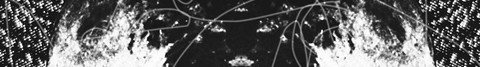
polar sky wrote:here is one more, sorry i made so many :oops:

Image


Okay, that's one too many!


Just kidding, I love it. :)
fuel for black quartz

User avatar
Posts Quantity
Status: Offline
Posts: 131
Joined: 4 Dec 2008
polar sky wrote:Image

Image

Image
Just wow.

User avatar
Dayvan Cowboy
Status: Offline
Posts: 2074
Joined: 15 Apr 2007
Location: Aberaeron
polar sky wrote:Image

Image

Image


:)

User avatar
Dayvan Cowboy
Status: Offline
Posts: 1378
Joined: 1 Jul 2008
Location: Bolton, Greater Manchester
Broken_Drum wrote:
polar sky wrote:Image

Image

Image
Just wow.


Very beautiful

User avatar
Sherbet Head
Status: Banned !
Posts: 591
Joined: 12 Jun 2009
polar sky wrote:Image

Image

Image


YESSSSSS!!!!!!!!!!!!!

These are like the ones numerator did!!! AWESOME WORK!!!!!! brilliant!

User avatar
Dayvan Cowboy
Status: Offline
Posts: 1680
Joined: 2 Nov 2006
Location: Thailand, Japan, US, Netherlands, Australia
Numerator wrote:Image

Image

a tad predictable I know


These two are so simple that they're awesome. 8)

And while we're at this, can we vote to change the twoism color scheme? :)

User avatar
Drone Operator
Status: Offline
Posts: 4655
Joined: 28 Nov 2004
Great four new entries by Polar Sky. I absolutely love those.

They're added to the contest page now: http://bocpages.org/wiki/bocpages:Skins#Polar_Sky

User avatar
Sherbet Head
Status: Offline
Posts: 700
Joined: 25 Sep 2009
Location: The Soviet Russia, where is vodka, bears and very cold winters
I've tryed to fix my today's morning photo :D
Image Image
Image Image
Last edited by Patryk Ludamage on Wed Nov 18, 2009 1:53 pm, edited 1 time in total.

User avatar
Sherbet Head
Status: Offline
Posts: 893
Joined: 15 Nov 2007
Location: Cape Town, South Africa
Fredd-E wrote:Great four new entries by Polar Sky. I absolutely love those.

They're added to the contest page now: http://bocpages.org/wiki/bocpages:Skins#Polar_Sky


I like them the most.

User avatar
Sherbet Head
Status: Offline
Posts: 700
Joined: 25 Sep 2009
Location: The Soviet Russia, where is vodka, bears and very cold winters
Here all my experiment photo banners :)

Image Image
Image Image
Image Image
Image Image
Image Image
Image Image
Image Image
Image Image
Image Image
Image Image
Image Image
Image Image
Image Image

User avatar
Dayvan Cowboy
Status: Offline
Posts: 1394
Joined: 19 Aug 2009
Location: england
Patryk Ludamage wrote:Here all my experiment photo banners :)

Image Image
Image Image
Image Image
Image Image
Image Image
Image Image
Image Image
Image Image
Image Image
Image Image
Image Image
Image Image
Image Image


they just don't quite have that "boc feel" at the moment
but toy with these a bit and some of them have definite potential
I love the mountain one
:)
Image
if you are reading this you are spending too much time at your computer. go outside and get some fresh air.

User avatar
Drone Operator
Status: Offline
Posts: 4655
Joined: 28 Nov 2004
Patryk,

I don't know what you've done in all the entries you've shown but in some way you managed to screw up the quality of the logo? It's garbled. I won't post them like this. You need to use the PSD file and don't touch the logo layer. You can't even fill the logo layer with a different color as that will deteriorate the quality.

Also 5 submissions per person max. ;-)

User avatar
Sherbet Head
Status: Offline
Posts: 700
Joined: 25 Sep 2009
Location: The Soviet Russia, where is vodka, bears and very cold winters
Fredd-E wrote:Patryk,

I don't know what you've done in all the entries you've shown but in some way you managed to screw up the quality of the logo? It's garbled. I won't post them like this. You need to use the PSD file and don't touch the logo layer. You can't even fill the logo layer with a different color as that will deteriorate the quality.

Also 5 submissions per person max. ;-)


Sorry - i don't know were others got in good quality logo (Used magic wand in Photoshop?) FUUUU...i havn't photoshop (it's always makes me an errors in program) Maybe someone can give me a png of logo plz )

User avatar
Happy Cycler
Status: Offline
Posts: 4346
Joined: 13 Apr 2006
Location: US
Patryk Ludamage wrote:
Fredd-E wrote:Patryk,

I don't know what you've done in all the entries you've shown but in some way you managed to screw up the quality of the logo? It's garbled. I won't post them like this. You need to use the PSD file and don't touch the logo layer. You can't even fill the logo layer with a different color as that will deteriorate the quality.

Also 5 submissions per person max. ;-)


Sorry - i don't know were others got in good quality logo (Used magic wand in Photoshop?) FUUUU...i havn't photoshop (it's always makes me an errors in program) Maybe someone can give me a png of logo plz )


What does that even mean?

User avatar
Happy Cycler
Status: Offline
Posts: 4346
Joined: 13 Apr 2006
Location: US
Also, do you think people should be crediting other people's photography? I would be pretty pissed if I saw my own work being used with out permission. Just a thought.

User avatar
Sherbet Head
Status: Offline
Posts: 700
Joined: 25 Sep 2009
Location: The Soviet Russia, where is vodka, bears and very cold winters
Fredd-E wrote:Patryk,

I don't know what you've done in all the entries you've shown but in some way you managed to screw up the quality of the logo? It's garbled. I won't post them like this. You need to use the PSD file and don't touch the logo layer. You can't even fill the logo layer with a different color as that will deteriorate the quality.

Also 5 submissions per person max. ;-)


I'am really sorry for the quality :(
Maybe that works looks better now? :( :( :(

Image Image
Image Image
Image Image
Image Image
Image Image

User avatar
Dayvan Cowboy
Status: Offline
Posts: 1558
Joined: 13 Jun 2007
Location: Worcester, Massachusetts
are these your photos?
FUTURE FOREST DESIGN:
http://www.futureforestdesign.net

MOSS ARCHIVE MUSIC COLLECTIVE:
http://www.mossarchive.net

PreviousNext

Return to Boards of Canada

Who is online

Users browsing this forum: turquoise70 and 43 guests