
Do you know to which compilation you submitted a track to?KDRUM wrote:Aesthetics wrote:KDRUM wrote:why not jus put the best tracks on a comp unmixed?
What's the problem? You only submitted a track and don't take any participation in this community whatsoever, yet you question the whole concept. This mixed compilation series is called One on Twoism for a reason, and this is how it developed. There is no hurry to finish this.
the whole concept I thought was to submit music?
One on Twoism Volume 5 [Submission Topic]
Moderator: Aesthetics
-

- Site Admin
- Status: Offline
- Posts: 5432
- Joined: 25 Nov 2004
- Location: Lowlands
Life is a Frequency
-
- Happy Cycler
- Status: Offline
- Posts: 3051
- Joined: 12 May 2006
- Location: Australia
KDRUM wrote:Aesthetics wrote:KDRUM wrote:why not jus put the best tracks on a comp unmixed?
What's the problem? You only submitted a track and don't take any participation in this community whatsoever, yet you question the whole concept. This mixed compilation series is called One on Twoism for a reason, and this is how it developed. There is no hurry to finish this.
the whole concept I thought was to submit music?
yeah...
and then it's mixed together like a DJ mix...
it's not that hard to comprehend bro.
-
- Happy Cycler
- Status: Offline
- Posts: 4346
- Joined: 13 Apr 2006
- Location: US
Aesthetics does a fantastic job every year with these comps. There are many many more members submitting tracks now than there were several years ago when the first couple of volumes came out. And I bet a lot of em are new members who never post anything that just registered on here to get their track on the comp.
I can imagine he's going through a shit ton of tracks and trying to wrap his head around them all and which ones to choose and fit together.
Take your time man, you do great work with these.
I can imagine he's going through a shit ton of tracks and trying to wrap his head around them all and which ones to choose and fit together.
Take your time man, you do great work with these.
Last edited by polar sky on Fri Feb 17, 2012 9:07 pm, edited 2 times in total.
-

- Telepath
- Status: Offline
- Posts: 8812
- Joined: 30 May 2007
- Location: Dorset, UK
polar sky wrote:Take your time man, you do great work with these.
Well said Polar.
Slow down...
-
- Dayvan Cowboy
- Status: Offline
- Posts: 1341
- Joined: 24 Oct 2007
- Location: Greater Manchester, UK
KDRUM wrote:Aesthetics wrote:The release will most likely be around April/May. I really need this time to figure out what the best flow will be.
I'm still at the beginning stage. So far I don't even have one decent pair of tracks mixed into each other so I have a looooooong way to go.
What's more important now is to have someone who can build a site. The artwork is coming along nice though.
you make it sound so difficult,
It's more difficult than you think unless you want the final product to be of shoddy quality. Aesthetics doesn't get paid for doing this and does it all for the love of the project and the community whilst also leading a regular life like the rest of us, which doesn't permit 24 hours a day to put it together. Take all the time you need until you're happy with it, don't let anyone else tell you otherwise!
Please 'Like' the Retronym Facebook page at http://www.facebook.com/retronymlabel if you enjoy our free releases, spread the word! http://www.retronym.co.uk
-
- Eagle Minded
- Status: Offline
- Posts: 286
- Joined: 1 Jul 2009
- Location: Somewhere sometime
Aesthetics wrote:Cupz wrote:I can give it a shot, but I'm not a graphic artist. I do know flash like the back of my hand. Anyone with a sharp eye for graphics wanna help?rik0000 wrote:If one of the designers can come up with a site design (with all details figured out), I don't mind turning it in a website. A photoshop file or even a high quality jpg/png as a source works for me, as long as I only have to cut it up...
Why don't you guys team up? Once the artwork is chosen I guess you guys can work something out, right?
Well my flash skills are a bit rusty and I don't have Adobe Flash atm. I would say, if a designer has an idea with animation/a lot of user interaction which needs flash, you should contact Cupz. For plain html/css/javascript you could send me a message and we'll work something out.
Unexpect the expected
-

- Boqurant
- Status: Offline
- Posts: 52
- Joined: 8 Feb 2010
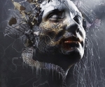
Polar's OOT5 cover art is fantastic. Personally I think the 4th one where the pentagon separates the blackness of the outside from the atmosphere on the inside is perfect. Isn't that what the music on OOT is about? Giving us an escape from this world and entering us into another. I feel that the image is making a strongly visual suggestion. Inside there is a world of beauty (fantastic skyline) and outside there is nothing to distract you. It looks slick, professional and has a very clear visual impact.
That being said, the sunset is also fantastic. I feel it's a shame that the back story of the picture can't really be told as it's part of what makes it interesting to me. Could you make a version of this picture with the outside of the pentagon blacked out like the other one? Just to see what it's like. pleeeeeeeease x
That being said, the sunset is also fantastic. I feel it's a shame that the back story of the picture can't really be told as it's part of what makes it interesting to me. Could you make a version of this picture with the outside of the pentagon blacked out like the other one? Just to see what it's like. pleeeeeeeease x
One Daw to rule them all,One Daw to find them,
One Daw to bring them all,and in the darkness bind them. x Reaper x
One Daw to bring them all,and in the darkness bind them. x Reaper x
-
- Boqurant
- Status: Offline
- Posts: 56
- Joined: 17 Apr 2005
Aesthetics wrote:What's more important now is to have someone who can build a site. The artwork is coming along nice though.
The site design should follow the design of the artwork, that is why no one has submitted any site yet, since designers are waiting for a winner among those artwork candidates in order to set the fundamental theme for the upcoming website.
I've Been Gone About A Week.
http://soundcloud.com/illuminant
http://soundcloud.com/illuminant
-

- High Scorer
- Status: Offline
- Posts: 10503
- Joined: 19 Nov 2005
Geogaddi wrote:Aesthetics wrote:What's more important now is to have someone who can build a site. The artwork is coming along nice though.
The site design should follow the design of the artwork, that is why no one has submitted any site yet, since designers are waiting for a winner among those artwork candidates in order to set the fundamental theme for the upcoming website.
yes
-
- Site Admin
- Status: Offline
- Posts: 5432
- Joined: 25 Nov 2004
- Location: Lowlands
First off thanks for the supporting posts 
Geo & Cupz: I know there has to be a theme first but with the other editions (except OoT3) there already was someone who offered his skills to program and design a site at this stage. We now have 2 programmers but no designer. I also said it to bend the whole discussion away from the "who and when" questions.
Geo & Cupz: I know there has to be a theme first but with the other editions (except OoT3) there already was someone who offered his skills to program and design a site at this stage. We now have 2 programmers but no designer. I also said it to bend the whole discussion away from the "who and when" questions.
Life is a Frequency
-
- Happy Cycler
- Status: Offline
- Posts: 4346
- Joined: 13 Apr 2006
- Location: US
Kiwibaws wrote:Polar's OOT5 cover art is fantastic. Personally I think the 4th one where the pentagon separates the blackness of the outside from the atmosphere on the inside is perfect. Isn't that what the music on OOT is about? Giving us an escape from this world and entering us into another. I feel that the image is making a strongly visual suggestion. Inside there is a world of beauty (fantastic skyline) and outside there is nothing to distract you. It looks slick, professional and has a very clear visual impact.
That being said, the sunset is also fantastic. I feel it's a shame that the back story of the picture can't really be told as it's part of what makes it interesting to me. Could you make a version of this picture with the outside of the pentagon blacked out like the other one? Just to see what it's like. pleeeeeeeease x


-

- Eagle Minded
- Status: Offline
- Posts: 365
- Joined: 24 Jun 2006
- Location: North Carolina
I really like Subset's artwork, so I'm putting in my vote for that.
Some of Polar Sky's are nice too, but I'm not keen at all on the pink-and-turquoise trees with the photoshop-looking yellow glow.
Some of Polar Sky's are nice too, but I'm not keen at all on the pink-and-turquoise trees with the photoshop-looking yellow glow.
-
- Happy Cycler
- Status: Offline
- Posts: 4346
- Joined: 13 Apr 2006
- Location: US
esselfortium wrote:I really like Subset's artwork, so I'm putting in my vote for that.
Some of Polar Sky's are nice too, but I'm not keen at all on the pink-and-turquoise trees with the photoshop-looking yellow glow.
How do you suggest I achieve a less photoshop looking outer glow?
-
- High Scorer
- Status: Offline
- Posts: 10503
- Joined: 19 Nov 2005
polar sky wrote:esselfortium wrote:I really like Subset's artwork, so I'm putting in my vote for that.
Some of Polar Sky's are nice too, but I'm not keen at all on the pink-and-turquoise trees with the photoshop-looking yellow glow.
How do you suggest I achieve a less photoshop looking outer glow?
no outer glow....
-
- Happy Cycler
- Status: Offline
- Posts: 4346
- Joined: 13 Apr 2006
- Location: US
Cupz wrote:polar sky wrote:esselfortium wrote:I really like Subset's artwork, so I'm putting in my vote for that.
Some of Polar Sky's are nice too, but I'm not keen at all on the pink-and-turquoise trees with the photoshop-looking yellow glow.
How do you suggest I achieve a less photoshop looking outer glow?
no outer glow....
I understand that, but my question was how to have an outer glow without it looking so "Photoshoped. Maybe I will print the pentagon sunset out, paste it on cardboard and shine a light from the back and the front then take a 110 of that, hahaha. Fuck it. Here it is without the glow:


-
- Sherbet Head
- Status: Offline
- Posts: 796
- Joined: 18 May 2008
- Location: Edinburgh, Scotland
I like that last one polar, there is a really nice feeling to that one.
The plain border seems to work very well, I think it looks better than the ones with the "glow".
I also second that Aesthetics should take as much time as he needs for this, there is no
rush, The final compilation will be all the better for it.
[edit]
I just had an idea...
If you are uncomfortable with such a clean edge perhaps you could somehow tie it in with a pentagon aperture type thing. Look at the bookeh in this photo for an idea. Just a thought, but it the clean edge really is nice as it is.

[/edit]
The plain border seems to work very well, I think it looks better than the ones with the "glow".
I also second that Aesthetics should take as much time as he needs for this, there is no
rush, The final compilation will be all the better for it.
[edit]
I just had an idea...
If you are uncomfortable with such a clean edge perhaps you could somehow tie it in with a pentagon aperture type thing. Look at the bookeh in this photo for an idea. Just a thought, but it the clean edge really is nice as it is.
[/edit]
-
- Dayvan Cowboy
- Status: Offline
- Posts: 1177
- Joined: 21 Jul 2011
I think I missed the deadline. Damn you career!
-
- Boqurant
- Status: Offline
- Posts: 52
- Joined: 8 Feb 2010
Polar, you've hit the nail on the head with those IMO. Personally I like the glow and I think it's only really an issue to people who have used photoshop and recognise the effect. I don't use it so looking at it with naked and unbiased eyes, I think it looks great. Also looks nice and concise without the glow.
Either of the 2 sunset pentagons get my vote for certain.
Either of the 2 sunset pentagons get my vote for certain.
One Daw to rule them all,One Daw to find them,
One Daw to bring them all,and in the darkness bind them. x Reaper x
One Daw to bring them all,and in the darkness bind them. x Reaper x
-
- Boqurant
- Status: Offline
- Posts: 52
- Joined: 8 Feb 2010
On another note, Pantheon just gave me an idea. There's no doubt in my mind that we should go OTT for OOT5. We'll only make OOT5 once, and since 5 is a symbolic number why not (discreetly) feature as many fives as possible? Everyone who submitted a track should draw a pentagon, however big and whatever colour, on their hand. Then take a picture of their outstretched hand ( such as pantheon's) with all FIVE fingers erect(lol). Then we mash these pictures together and can add it to the sleeve or the site.
Effectively like hollywood hand-prints, but without the hollywood bullshit
Effectively like hollywood hand-prints, but without the hollywood bullshit
One Daw to rule them all,One Daw to find them,
One Daw to bring them all,and in the darkness bind them. x Reaper x
One Daw to bring them all,and in the darkness bind them. x Reaper x
Who is online
Users browsing this forum: No registered users and 7 guests