Ray wrote:My 5 for now. Thanks for the feedback guys, and gals. All photos are taken and owned by me. Cheers.


Very, very well done.
Moderators: Aesthetics, Drones, Hexagon Sun
Ray wrote:My 5 for now. Thanks for the feedback guys, and gals. All photos are taken and owned by me. Cheers.
polar sky wrote:
Riiiiiip.

I love it! Rip, Smack! Boom! Me like!Neels wrote:polar sky wrote:
Riiiiiip.
What exactly do you mean by this? I'm a bit confused, I guess..
Sac wrote:
Very, very well done.


Ray wrote:
My 2 favorites.
I'd be interested in seeing the picture in the first one flipped. Meaning the person would be on the right side of the banner. I think the Mt's and water would contrast against the logo nicely. Just a friendly suggestion. Cheers.
Ray wrote:
My 2 favorites.
I'd be interested in seeing the picture in the first one flipped. Meaning the person would be on the right side of the banner. I think the Mt's and water would contrast against the logo nicely. Just a friendly suggestion. Cheers.


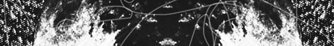
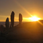
polar sky wrote:I used a 1984 Kodak Fisher Price 110 Film Camera using 110 film. And a Dollar Store Camera with 35 mm expired film. The grain comes from the dust and the hairs that is in the housing of the camera that get trapped on the film, the light leaks are from it being a plastic camera.
This is the one I use:
Mexicola wrote:Aesthetics wrote:@Mexicola: The bottom one is missing the logo and isn't the right size you know.
Lol - cheeky scamp
Although if SOTL ever need a banner it would work a treat..
Mexicola wrote:
and just for my own amusement one other that I didn't submit as an entry. This was taken at around 1AM near John O'Groats in the far North of Scotland. It didn't actually get any darker than this all night, which was quite surreal..


bananaoctopus wrote:I thought I'd have a quick crack anyway. I was aiming for mood above everything else here. Type is pretty basic – needs a bit more work. The actual logo "symbol" is a "b" and a "p" constructed out of hexagonal shapes.
Thoughts anyone? Is the direction okay?
BTW I was listening to Corsair while I put this together.
Snufkin wrote:bananaoctopus wrote:I thought I'd have a quick crack anyway. I was aiming for mood above everything else here. Type is pretty basic – needs a bit more work. The actual logo "symbol" is a "b" and a "p" constructed out of hexagonal shapes.
Thoughts anyone? Is the direction okay?
BTW I was listening to Corsair while I put this together.
Just on top of Fredd-E's comments, for anyone else making banners... I give my awesome-approval to that ripped-sticker effect at the edges of this one. totally awesome
bananaoctopus wrote:Bummer, sorry everyone. I should have read through the thread a bit more. I think i got a bit excited.
dave_from_2001 wrote:
hey, its too late because the contest is now at stage two
Users browsing this forum: jeannedarme and 29 guests