Tomorrow's Harvest

Everything related to our favorite Scottish duo.

Moderators: mdg, Mexicola, 2020k, Fredd-E, Aesthetics

User avatar
Dayvan Cowboy
Status: Offline
Posts: 1045
Joined: 8 Feb 2011
Location: The Great White North(east)
The Other wrote:If this has been mentioned my apologies.

I hope they send over some stickers and other extras much like past releases.

Just a thought.


That would be grand, how I wish I had known boc way back when, I'd have a Geogaddi vinyl by now...
oh well, have to live with the times ;)

User avatar
Sherbet Head
Status: Offline
Posts: 623
Joined: 24 Apr 2013
Magrathea wrote:
Rodheh wrote:
wwbjd wrote:
Opothecary wrote:
NorthcutTAmnestY wrote:Yeah, I'm not really feeling the cover art for whatever reason.


My guess is because it (combined with the title font) seems to be going for more of an early 80s feel rather than the usual warm 70s vibe their covers exude. I think it's going to be a dark, Reagan era cold war "what if they dropped the nukes?" type concept album.


Yep. To me, this looks like a total early 80's style. Completely different look/feel than their previous albums. Kind of hoping the music is too!


So they're moving on. What if that means we might see an early 90's style BoC album someday? That'd have to be their last.


An artist's freedom is to change, that's why tons of people call their former favorite band sellouts over time, really it happens all the time. For one I am eager to hear their new material, I have a feeling that at first I will be unsure but that it will grow on Me. I can't wait!


Exactly. If you want to hear what someone did on past albums, than listen to those albums. Getting what's next is the best thing about music. I expect growth and evolution in everything I listen to.

User avatar
Posts Quantity
Status: Offline
Posts: 100
Joined: 3 Jan 2007
Location: TX
Finally. A reason to post for the first time in years. YES!!!
Image

User avatar
Eagle Minded
Status: Offline
Posts: 443
Joined: 27 Feb 2012
Location: UK
Mark Radcliffe and Stuart Maconie on BBC Radio 6 Music

http://www.bbc.co.uk/programmes/b01s5f32

Check at around 51:00 / 52:00 minutes for a small mention during yesterday afternoon's show, referred to while discussing Noah and the Whale... Sounds as if Stuart was quite intrigued by the whole business of the past week as well!

User avatar
Posts Quantity
Status: Offline
Posts: 112
Joined: 23 Apr 2013
I totally love 80s stuff (i still prefer VHS, actually) and it would be pretty great if they were going for that era with their sound as well; I also don't think they have to stay within a certain sound either. I don't think I am entitled to anything and they can do what they want with their music.

I just don't care much for the cover, but I do like the font.

Actually, take out that cityscape and I could totally get behind it. The cityscape isn't needed at all to convey the same message.

I actually really like Krug's stuff too. Everything about what he does screams "hipster shit" but I dunno, I feel a lot of genuineness from it - from his photos at the least.

User avatar
Boqurant
Status: Offline
Posts: 73
Joined: 4 Oct 2011
Location: Minneapolis
If Aphex Twin releases an album before the year is over, then this really will be the greatest year in music of at least my lifetime.

User avatar
Sherbet Head
Status: Offline
Posts: 776
Joined: 4 Jun 2009
Location: Houston
Strange timing in all of this; I moved into my current place right around the time TCH ep was put out and now I am moving outta the same place just now as TH is coming out! I went through hell in this last place....glad to move on....those Coschea tones are my call that it's time to go and move on to what's next....I am open to YES!!!!
Last edited by Torn n Frayed on Wed May 01, 2013 5:55 am, edited 1 time in total.

User avatar
Posts Quantity
Status: Offline
Posts: 138
Joined: 24 Apr 2013
Location: Seattle, Washington
thepastinsidepressant wrote:
NorthcutTAmnestY wrote:Yeah, I'm not really feeling the cover art for whatever reason.


if the music fits then great, but as it is it gives me a bad feeling in its bordering clichés. its cinematic in feel no doubt, 70s and 80s. The font Avant Garde has been around since the 70s and the trick is still used to convey this period. Unfortunately it has become 'hip' overused (espeically its Alternates) combined with this new wave of instagram style photography or just simply evocative. It was also used on ABPOITC... 70s.

Geogaddi still my fave, its just so unusual and original looking.


I am not too worried about the cover because I know it will just come to represent the music to me and so I will just end up loving it like an unremarkable looking but wonderful pet.

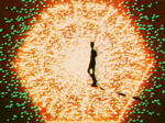
I am still convinced this record will be firmly planted in the 70's if it is in fact a concept record based on the Deadly Harvest film. It is weird though how when I look at pictures from the early 80's, the 70's seem to be creeping up on them and infecting them with that fuzzy decaying emulsion look. The early 80's seem more like the 70's to me every day. :-)

I do also think Instagram is starting to ruin the fun though and now everything is all over nostalgalated. I am reminded of that Onion headline "U.S. Dept. Of Retro Warns: 'We May Be Running Out Of Past'".

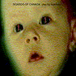
I love the Geogaddi cover too and especially the gatefold and all the bits that come with the limited edition CD too. I still think the cover of MHTRTC is my fav though. That cover and the record itself are just absolutely perfect to me. Sigh...

User avatar
Eagle Minded
Status: Offline
Posts: 323
Joined: 31 Mar 2011
Location: San Marcos, Texas
I'm pretty sure that track isn't on the album, and I didn't like it at first, but man I keep getting drawn back to it and something about it is just hitting me hard. It's great.

User avatar
Dayvan Cowboy
Status: Offline
Posts: 1470
Joined: 11 Aug 2005
Location: San Francisco, California
Tomorrow's Harvest!!! I haven't been this excited for a new album probably since TCH was announced in 2005! 2013 is a hell of a year for music: the best year in memory since 2001 I'd say (which was monstrous)... Let's compare with some highlights:

2001

Aphex Twin - drukQs
Squarepusher - Go Plastic
Autechre - Confield
Phoenecia - Brownout
Bola - Fyuti
Brothomstates - Claro
Chris Clark - Clarence Park
Radiohead - Amnesiac
Daft Punk - Discovery
Plaid - Double Figure
Depeche Mode - Exciter
Venentian Snare - many albums
Richard Devine - Lipswitch
Wagon Christ - Musipal
Telefon Tel Aviv - Fahrenheit Fair Enough
Stars of The Lid - Tired Sounds of Stars of The Lid
Bjork - Vespertine
ADULT. - Resuscitation
Ulrich Schnauss - Far Away Trains Passing By

So yeah... 2001 was fucking massive.

2013 (released and announced)

Autechre - Exai
My Bloody Valentine - MBV
Boards of Canada - Tomorrow's Harvest
Arovane - Ve Palor
Fieldtriqp - Hidden Tracks
David Bowie - The Next Day
Telefon Tel Aviv - New Album later this year
ADULT. - The Way Things Fall
The Knife - Shaking The Habitual
mu-ziq - Somerset Avenue Tracks (1992-1995) / XTEP / Chewed Corners LP/ Heterotic album
Atoms For Peace - Amok
Depeche Mode - Delta Machine
Bibio - Silver Wilkinson
Quinoline Yellow - Palisade Mount EP
Bola - New Album
Machinedrum - New Album on Ninja Tune
Ulrich Schnauss - A Long Way To Fall
Plaid - New Material

I'm missing loads I know, but what a year it's been thus far!
My debut Sweguno EP 'Adapteras' is available here: https://atavisticspasmrecords.bandcamp. ... apteras-ep

User avatar
Posts Quantity
Status: Offline
Posts: 108
Joined: 27 Jul 2010
Location: Norway
North by North wrote:
rainier wrote:
thepastinsidepressant wrote:
NorthcutTAmnestY wrote:Yeah, I'm not really feeling the cover art for whatever reason.

Unfortunately it has become 'hip' overused (espeically its Alternates) combined with this new wave of instagram style photography or just simply evocative. It was also used on ABPOITC... 70s.

Geogaddi still my fave, its just so unusual and original looking.


I like this cover but I know what you mean. That's how I feel about a lot of the Neil Kruger stuff tbh.


What if this wasn't event the cover art? What if the track names are fake? That would be funny. I'm 99% sure this not the case, but with BoC, you never know. That's one of the many things I love about them- never sure. I just posted this for laughs, so don't think I'm so far off the edge that I don't buy my own reflection. Although, sometimes my refelection doesn't feel like me. But anyway... :)


Technically speaking, wouldn't it be illegal selling the product under completely false premises? hence they've sold it to thousands of people by now ? :wink:

User avatar
Friendly Stranger
Status: Offline
Posts: 10
Joined: 22 Aug 2008
Location: Poland / Lodz
NorthcutTAmnestY wrote:I totally love 80s stuff (i still prefer VHS, actually) and it would be pretty great if they were going for that era with their sound as well; I also don't think they have to stay within a certain sound either.


me too, I love boc music, because in every track they created masterfully essence of this 70's, 80's, so nostalgic, so mysterious. Teasers (cosecha signal one and tomorow harvests short clip) are mind blowing and I feel that new album will be piece of art.

New Seed
Status: Offline
Posts: 8
Joined: 30 Nov 2011
Does anyone know if PIC has done the artwork?

First time I've logged in since the announcement but I was following very closely. Have to say I'm over the (red)moon!!!

User avatar
Happy Cycler
Status: Offline
Posts: 4955
Joined: 1 Dec 2005
Ok be honest. How many of you have the album cover as your desktop wallpaper right now? :)

User avatar
Boqurant
Status: Offline
Posts: 50
Joined: 30 Apr 2013
Location: Forever on the grid
mechanismj wrote:Ok be honest. How many of you have the album cover as your desktop wallpaper right now? :)


8)

Image
'All data that exists is both reality and fantasy. Whichever it is, the data a person collects in a lifetime is a tiny bit compared to the whole.'
http://boardsofcanada2013.tumblr.com

User avatar
Posts Quantity
Status: Offline
Posts: 136
Joined: 18 Jan 2010
NorthcutTAmnestY wrote:I just don't care much for the cover, but I do like the font.

Actually, take out that cityscape and I could totally get behind it. The cityscape isn't needed at all to convey the same message.


Image[/img]

User avatar
Sherbet Head
Status: Offline
Posts: 753
Joined: 20 Sep 2010
^

Excellent. Thanks for that pic.

User avatar
Posts Quantity
Status: Offline
Posts: 229
Joined: 23 Apr 2013
Location: Stroud
If anyone can be bothered to try to organise it, the Union Chapel in London doesn't appear to have anything currently booked in for the release date, so could see about having a listening party there?

http://store.unionchapel.org.uk/
spacehire@unionchapel.org.uk

Would be quite cool given it's where BoC held a Geogaddi listening party in 2002. I drafted an email but am wary of doing it myself as I wouldn't have time to organise it if there was a lot to sort out.

User avatar
Happy Cycler
Status: Offline
Posts: 4955
Joined: 1 Dec 2005
Wow, taking the cityscape out really kind of "cheers up" the whole image. Looks all bright and summery!

User avatar
Sherbet Head
Status: Offline
Posts: 836
Joined: 31 Oct 2012
Location: UK
Integer wrote:
NorthcutTAmnestY wrote:I just don't care much for the cover, but I do like the font.

Actually, take out that cityscape and I could totally get behind it. The cityscape isn't needed at all to convey the same message.


Image[/img]


Wow. That looks lovely

PreviousNext

Return to Boards of Canada

Who is online

Users browsing this forum: No registered users and 139 guests