One on Twoism - Volume 3 [Artwork Submission]

WE DON'T BЯAINWASH

Moderator: Aesthetics

User avatar
Posts Quantity
Status: Offline
Posts: 158
Joined: 5 Aug 2007
Location: Nashville, TN
Here's a little more food for thought, I can't take credit for the images... they are photos my daughter took while visiting Minneapolis and Fargo last winter:

Image

Image

Image
Image

User avatar
Happy Cycler
Status: Offline
Posts: 3051
Joined: 12 May 2006
Location: Australia
Love the last one

User avatar
Happy Cycler
Status: Offline
Posts: 4880
Joined: 7 Jun 2007
Location: the system
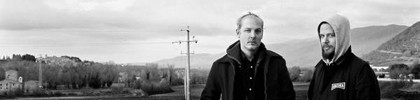
ArtOfTheGroove wrote:Here's a little more food for thought, I can't take credit for the images... they are photos my daughter took while visiting Minneapolis and Fargo last winter


Lovin the first and last ones! (Also yay Minneapolis and Fargo)
another silo full / another dark dawn / bending the air / love is so small

returnal \ you've never left \ you've been here the whole time

User avatar
Sherbet Head
Status: Offline
Posts: 987
Joined: 16 Aug 2007
I like the first one, but I hate the font.
Viper.

User avatar
Dayvan Cowboy
Status: Offline
Posts: 1279
Joined: 24 Aug 2007
CoBoC wrote:I like the first one, but I hate the font.


I agree, the first and last are great, but the font feels out of place.

User avatar
Dayvan Cowboy
Status: Offline
Posts: 1680
Joined: 2 Nov 2006
Location: Thailand, Japan, US, Netherlands, Australia
The font on those (ArtOfTheGroove's) is too New York Metro stylized or something.

Sarin's cover is awesome and looks the most professional, but it looks almost a bit over-produced. Maybe if it was simpled up a little. It currently gives me more of a drum and bass feel, where i think the feeling of twoism is more organic and mellowed out.

I like Earthbound's cover for a start, but the font is a little dark and hard to read.

Just my 2 cents.
”.pu ekaW .live si tenretnI ehT”

User avatar
Posts Quantity
Status: Offline
Posts: 158
Joined: 5 Aug 2007
Location: Nashville, TN
CoBoC wrote:I like the first one, but I hate the font.


Yeah, I don't have many really cool fonts. If anyone wants to fiddle with the photos I put them up here (without any text on them):

www.artofthegroove.com/twoism_art/kera_pic_1.jpg

www.artofthegroove.com/twoism_art/kera_pic_2.jpg

www.artofthegroove.com/twoism_art/kera_pic_3.jpg
Image

User avatar
Sherbet Head
Status: Offline
Posts: 866
Joined: 12 Jun 2007
Location: Gold A
A few more possibilities..

Image

Image

Image

If you guys like one of them, let me know, I'll work some back covers out for yah.
And.. Fonts can be changed..

User avatar
Dayvan Cowboy
Status: Offline
Posts: 1279
Joined: 24 Aug 2007
I like the first one with the plane! Don't know about the font though, it feels a little out of place, imo.

User avatar
Dayvan Cowboy
Status: Offline
Posts: 1111
Joined: 2 Mar 2006
Location: Canada
the plane one is awesome :)

User avatar
Dayvan Cowboy
Status: Offline
Posts: 1680
Joined: 2 Nov 2006
Location: Thailand, Japan, US, Netherlands, Australia
Image
”.pu ekaW .live si tenretnI ehT”

User avatar
Nova Scotia Robot
Status: Offline
Posts: 5157
Joined: 15 Sep 2007
Location: Ontario, Canada
Very nice Earthbound, I like the plane one and the girl one.

Saturday Index, that cover is mint as well!

User avatar
Dayvan Cowboy
Status: Offline
Posts: 1680
Joined: 2 Nov 2006
Location: Thailand, Japan, US, Netherlands, Australia
Image

Image
”.pu ekaW .live si tenretnI ehT”

Posts Quantity
Status: Offline
Posts: 207
Joined: 30 Dec 2007
Location: space station 24
saturdayindex wrote:Image

Image


these!


User avatar
Telepath
Status: Offline
Posts: 8862
Joined: 30 May 2007
Location: Dorset, UK
sarinsunday wrote:Image


Ooooh! Nice..
Image

Slow down...

User avatar
Posts Quantity
Status: Offline
Posts: 158
Joined: 5 Aug 2007
Location: Nashville, TN
Couple more:

Image

Image
Image

User avatar
Dayvan Cowboy
Status: Offline
Posts: 1111
Joined: 2 Mar 2006
Location: Canada
those fonts ruin it for me imo
the picture is beautiful

User avatar
Telepath
Status: Offline
Posts: 8862
Joined: 30 May 2007
Location: Dorset, UK
SarinSundays font/lettering is definitely the best of the lot. I like the grainy element to his images too, but some of the other images could look lovely merged with his lettering perhaps? I dunno...
Image

Slow down...

User avatar
Sherbet Head
Status: Offline
Posts: 555
Joined: 17 Aug 2005
Location: Netherlands
Great work SarinSunday. I might give up already.

To all the others; ditch the bad fonts please. But some nice work.

PreviousNext

Return to Twoism Records

Who is online

Users browsing this forum: No registered users and 5 guests