I'm also working on a piece finally. Experimenting without a computer at least. I'll upload it within now and 23 hours and 7 minutes.
edit; Deadline is based on what timezone btw?
Moderator: Aesthetics


The timezone which suits you best FrankFrank wrote:Deadline is based on what timezone btw?
Retrodreaming wrote:<center>Btw i didnt make these and if someone would like to add the textI'm in the process of contacting the guy that made these,so i may have to wait for permission first....
[images]
Retrodreaming wrote:<center>Btw i didnt make these and if someone would like to add the text


Frank wrote:K, here we go.
...
Not 100% sure if the backcover fits the front real good, i might make it a bit lighter. Anyway, the front is totally finished so base your opinion on that one.
50% handmade 50% digital.
Any suggestions welcome ofcourse.


Aesthetics wrote:I second ArtOfTheGroove on this one.
Frank: I like the setup, there is something about the colourscheme which I don't like.
Frank wrote:Aesthetics wrote:I second ArtOfTheGroove on this one.
Frank: I like the setup, there is something about the colourscheme which I don't like.
The easiest to edit is the colours, i'm not so sure about the back myself. The cover is ok in my opinion, but might need some tweaking.


Joebot Kill wrote:OK... I tried for something a little more minimalistic and graphic. I've got like 9 variations of this. Here's two:
I really like this one:
Let me know what you think!

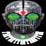
BrandNewRetro wrote:The one that looks like waveforms is my favourite.

ArtOfTheGroove wrote:BrandNewRetro wrote:The one that looks like waveforms is my favourite.
I'm sure that someone here can do this much better than me, but what if it WAS waveforms:
Users browsing this forum: No registered users and 5 guests